Pages

Tuesday, May 27, 2014

Indoor Decor

Even though I've neglected to post anything for a few weeks, I haven't made any further progress on my new piece.  I've been distracted by Mother's Day, Memorial Day, and all the warm spring weather we've been having in between!  Here are a couple of indoor projects I've managed to complete:


Above, I redecorated the dining room mantle shelf for the summer.  In early spring, the color scheme was spring green, yellow, and pink, but for the summer I chose nice cool blues, white and yellow.  My DH asked me to hang the illustration I did a few years back of Aesop's fable "The Wind and the Sun," and I used it as the color inspiration.  If you're not familiar with the fable, the wind and the sun are arguing about who is stronger.  They agree to a contest to see who can get a traveler to remove his coat.  The wind blows and blows, but that only makes the traveler  pull his coat more tightly around himself.  Then the sun smiles and shines and warms the air, and the traveler happily removes his coat.   This will be a gentle reminder to us to be more like the sun as we go about our days (a useful thing to remember when trying to get teens to cooperate)!

I also hung a new wreath on the front door, below.  I saw this here when I was looking for ideas on spring decorations.  It's very easy to make and could also be used as a centerpiece with some flowers or a candle in the center.

Hope you are enjoying the springtime as well!

Friday, May 9, 2014

New Project

One of my FANE friends works at the OSilas Gallery of Concordia College in Bronxville, NY.  Last summer, they held a juried art exhibition titled "Summer ARTiculated," which is summer-themed art in any media.  I didn't have my act together to enter anything, but my friend Vivien did, was accepted into the show and sold her piece (read about it here and here).  This year if I enter, I could choose from among some of my more summery pieces, or possibly make a new one.  I've been planning on doing something with a beach theme, maybe even a series, and I've already set aside a whole bunch of fabrics for it.   The silks and sheers I bought last weekend at the show will fit right in.  Here's how they look together:

I have an idea of how I want to piece these, but I haven't done this kind of piecing in a long time.  I remember that when I took Jane Davila and Elin Waterston's Artquilting 101 way back in 2004 that we practiced some curvy piecing, but I don't really remember how to do it.  Luckily, I bought their Art Quilt Workbook, which explains the whole process step by step!

It involves cutting the curve through the two fabrics you want to stitch together, making registration marks, pinning, and stitching...  Hmm, sound complicated, but I'll give it a shot.

Here I go...  so far, so good...

Hey, not too bad, at least it presses nice and flat!  But why are my registration marks showing?  Oops, I was supposed to flip the fabric and draw them on the wrong side (duh!).  I guess I'll have to scrub them off (or start again with new fabric!).

I manage to (almost) completely wash out those pencil marks (can you still see them?), and do three more strips using my air-soluble marker on the reverse, like the directions state!  Not bad!  I think I'll keep going...

Wednesday, May 7, 2014

Final NSQG Pics

Here are the last few Opposites and other stars from the 2014 World of Quilts:

"Fairy Realm" by Christine Wilhelm,

 "In and Out" by Cecelia Leiseroff,

"Winter Freeze, Spring Thaw" by Kathi Jahnke,

"Topsy-Turvy" by Carolyn Spiegel,

 "Murder of Crows, Bluebirds in Spring" by Linda Long,

and "Yikes, It's a Frog" by Clair Oehler.

 As you can see, each on is a unique take on the Opposites theme, and the techniques, styles, and subjects so very different that it's worth seeing them all!

Unfortunately, I missed photographing Natalya Aikens amazing work! It could be displayed two different ways and at first there was some discussion about which side went up, so I delayed photographing it and then ended up missing it altogether!  (So sorry, Natalya!)  Luckily, Natalya is great at photographing and posting her own work and you can see and read about her piece "Black and White" here.  Natalya currently has her own show at the Etui gallery in Larchmont, NY (see a preview here) and the opening is Friday evening from 6-8, so if you're in the area, stop by!

Finally, here are a few more quilts from the main floor that I couldn't resist photographing.

This one is by Mary Cannizzaro from South Salem, NY.  So many people wanted to see it up close and photograph it that I had to stand and wait a few minutes!  The color scheme and bold design were really eye-catching.

Here is a close up.  As she stated on her entry card, the center square was a purchased tablecloth to which she added the graphic pieced borders in matching colors.  I love how the quilting gives it a mosaic effect.  It must look stunning in a bedroom.

And my last pick from the show was the quilt below:


Isn't it sweet?  It's called "Awesome Wonder" and was created by Don Gough of Lincolndale, NY.  I love the way the splattered-paint background shimmers and makes the silhouettes really stand out.  It reminds me of a picture book illustration!

And that's it!  Now onto some new projects...

Tuesday, May 6, 2014

More From NSQG


Here are some more stunning quilts from "A World of Quilts" 2014. 

This piece, "The Silver and the Gold," was done by Nike Cutsumpas.  She held her two sides together with hook-and-loop fasteners so they can be pulled apart.  When one is turned the opposite way, they edges link together, almost like a jigsaw puzzle, so they can be displayed on a wall side by side.  Another breath-taking piece!
 

I neglected to write down the title of the next piece by Barbara Drillick (it was something like "the turning of the seasons").   Barabara carefully chose her background and leaf pieces to create this stunning effect when displayed over the stand or hung long way on a wall.


This playful piece by Vivien Zepf is titled "Leg-Os."  I believe it also has a unique way of being displayed on a wall, with the pieces hanging horizontally.  Clever!  The variety of human and chair legs is fun, as is the use of purple and yellow, opposites on the color wheel.


Here is Sonny Rieber's "Black and White"

and Fran Osinoff's "Complimentary, My Dear Watson, Complimentary."


Judy Gignesi's "Warm Winds, Cool Breezes" still has the kimono shape over the stand, with the back of each piece being the front of the other - very challenging to do!  Love the colors!

 Barbara Sferra used a similar color scheme in her piece, "Hot and Cold."

Finally, this is Nancy Mirman's "Night and Day."

 Nancy also had a table in the boutique, selling some of her gorgeous small pieces.  I love the ones on the canvases, with the unique found objects and interesting techniques.

Judy and Barbara S. also sold some of their work in the boutique.  Beautiful!

Sunday, May 4, 2014

Highlights from the NSQG World of Quilts


Every year, the Northern Star Quilter's Guild of Westchester County, NY has a huge World of Quilts show the first weekend in May.  As in the past three years, my FANE (FiberArts Northeast) group has garnered a classroom, hung our Spirit Flags in the hallway, and set up a special exhibit.  This year we did a variation on the kimonos we made last year (so we could use those cool stands one more time).  Based on the theme "Opposites,"  each piece was 18" wide by 52" long, with the added challenge that it could be hung over the stands as well as on a wall.  There were various ways this could be done and the issue was approached and solved in many different ways.  Here is how the room looked when you first entered it.  They really make quite an impression, all seen together like this.

 One of the first pieces to catch your eye was "Unzipped" by Carole Hoffman.  She loves portraits and always creates these colorful characters.  If this was hung on the wall long ways, one of the portraits would be upside down, so Carole solved this issue by adding zippers on the top and side.  When hung over the stand, they were connected at the top, but to be hung on a wall, they can be zipped together side by side!  Isn't that ingenious?  And her work is so fabulous too!  I love the woven backgrounds and sense of playfulness and spontaneity.

She also entered this large nude quilt into the pool for judging and received an honorable mention!  Way to go, Carole!

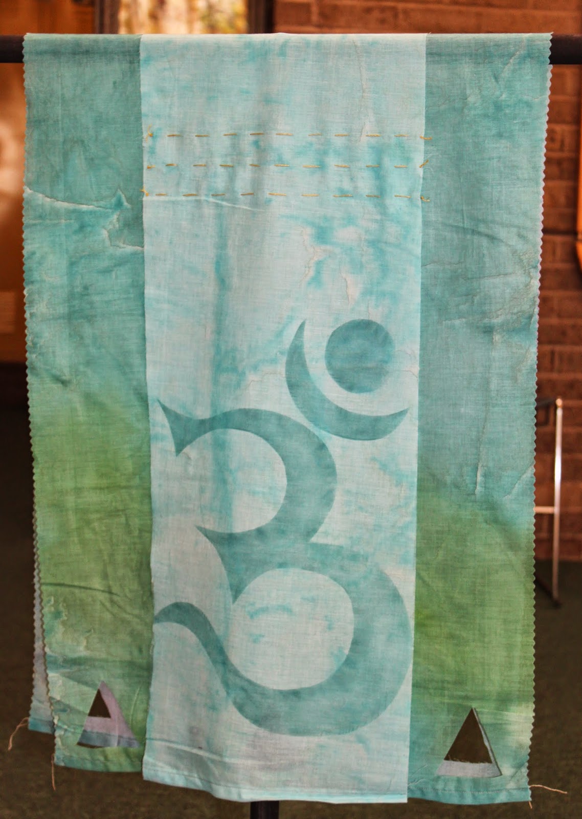
I found it interesting and fitting that the FANE artists that created some of my favorite "opposites" pieces also received ribbons on other quilts.  One of these is Norma Schlager.  Her opposites featured drifting ginko leaves using the complimentary colors red and blue in varying shades (hand-dyed, of course):

And below is her "Fractured II,"  which earned a second-place ribbon.

I also loved Joyce Sullivan's opposite, "Rough and Smooth," below:

Joyce changed the orientation of the two pieces so part of the back of one is visible from the other side. I just love the choice of colors and the wide range of techniques she used to create all that beautiful texture.  It reminds me of the view of farmland from an airplane.  Below is the "smooth" side.  Gorgeous!

Her small piece, "Hardware," won a first place ribbon!

Renee Fleuranges-Valdes created these colorful opposites.  Her quilting is so well done and color choices so vibrant!


This larger abstract piece, using similar colors, won a ribbon as well.

Jane Davila created this beautiful "Balance of Opposites."  It's so peaceful and zen-like, a breath of fresh air!


Jane didn't have any other quilts in the show, but she was busy manning her booth for Flourish!, her art-quilt supply shop.  Lots of eye candy here!

These next quilts are by Donna Chambers, who runs her own jewelry business and just does artquilts as a hobby!  As you can see, she is multi-talented, and her work is always striking.

This piece, below, won best-in-show for a small piece!  Well-deserved!  Read more about Donna on the FANE blog here.

My piece, "Winter and Summer," caught some eyes and got some nice compliments.  In truth, it wasn't completely finished, as I'd love to add some beading and embellishments to the Winter side (I think I'll save that for another time, though).  

 The vendors are always great at the NSQG show, and I couldn't resist doing a bit of shopping!  These colorful characters were tempting, but I think my girls are beyond the stuffed toy stage.

I did end up buying each of them a small handmade purse, perfect for holding a cell phone, some cards, cash, and ID.  Aren't they beautiful?

And after ogling all these ribbons and cool silks at Easy Pieceing's shop (from Brooklyn, NY)...

I couldn't help picking up a few things for myself!  They had a great variety bag of decent sized pieces of silk and other interesting fabrics in colors I love to use.  The one here in my hand is woven of metal thread and silk together - so cool!  It catches the light in such an unusual way.  I can't wait to create something with these!

I'll post some more quilts from NSQG this week...