Pages

Showing posts with label challenge. Show all posts

Thursday, January 8, 2015

New Year Exercises


In addition to getting back to the gym for the new year, I've been doing a little artistic exercise as well.  The FANE group is experimenting with 3-D art in the form of blocks (apparently, the people who created the gelli plate are now selling similar but larger blocks).  At our meeting last month, our inspiring and always-on-the-cutting-edge leader Jane Davila brought a bunch of these blocks she made by slicing up a piece of lumber 1 3/4 inches square.  We each took one or two to decorate in some creative mixed-media way.  

I needed a theme to help me approach this and went with "color opposites" using fabric.  I went through my stash and pulled out scraps that I thought would work, then painted, fused, stitched and cut to get pieces that looked like this:


In doing this exercise, I discovered a few things.  First, I don't often choose color opposites in my work.  I find the contrast to be too jarring - I like analogous and blended colors.  But using opposite colors definitely makes things stand out, as you can see from the squares above.  I tend to use variations on red and green a lot, including shades from deep jewel tones of ruby and emerald all the way to pale spring greens and pinks.  But I also really liked the yellow and purple combinations here - they really said "spring" to me.  The most challenging color combo for me to work with was orange and blue.  Another thing I discovered - I don't like working with squares!  Especially in such a small size, the rigid sides seemed so unnatural to me.  I definitely prefer more organic shapes.  But one thing that was nice about the cube idea is that it got me thinking how the sides all relate to each other, almost like a series in miniature.

Here are the finished cubes:


I'll keep one for myself and swap one at the meeting tonight.  How have you started off the new year?

P.S.:  Want to see more really cool cubes?  Go to the FANE blog.  You'll be amazed!

Wednesday, September 18, 2013

Paying it Forward


Last year in this post, I promised to "pay it forward" to my first three readers leaving a comment on this blog.  Well, I'm finally making good on my promise and sending off these little gifts.  The one above is for Norma, a very talented quilter in my FANE group who has been reading this blog faithfully for a long time and always has a supportive comment for me!   It's a little charm cluster necklace, with a spring green button from which the four charms dangle.  I made one special fabric leaf charm, since fabric is Norma's medium of choice for her art, and used other components that I already had in shades of green and blue, colors that are prevalent in her wardrobe.  Wear it in good health!

The earrings, below, are brass rings with purple teardrop crystals.  Mary R. in my Artcharms group will be receiving these.   Thanks for playing, you two, and now it's time for you to pay it forward to someone elsc!

Wednesday, September 4, 2013

Autumn Inspirations


You may have noticed that I haven't been as creatively productive lately as I usually am.  I guess I've been busy with the garden and trying to make the most of the lazy summer days (in other words, I've been reading!).  But the ArtCharms Yahoo group recently started an Autumn Leaf swap, and it sounded too good to pass up!  I ordered the small copper leaves, shown above, and enhanced them with some color.  They look as though they've been enameled, but I actually used something much more mundane and common - can you guess what it is?  Not acrylic paint...    It's plain old, drug-store variety NAIL POLISH!  My girls have boxes full of nail polish, in many colors, including orange and yellow, so I thought I would take advantage of the supplies at hand.  I'm pretty happy with the results;  I need to make a total of 21 charms, so this should keep me busy for the next week or so.

I also decided to enter another challenge in Cloth Paper Scissors magazine - a mixed-media stitched challenge.  The finished piece had to be 6"x6" and have three different media.  My friend Norma has been posting about her adventures using copper sheeting, and it reminded me that I had some in my stash that I hadn't played with in a while.  I guess my wandering mind combined the thoughts of autumn leaves with the copper and I came up with the idea below.  The backgrounds are fabrics, the tree trunk is paper layered on fabric with gel medium, and the leaves were cut from copper sheeting tinted with alcohol inks.  I decided to turn the square on point to make the tree fit better.  What do you think?

Saturday, May 25, 2013

Gift Tag Challenge

Quilting Arts Magazine is sponsoring another challenge, this one for their seasonal "Gifts" issue which comes out in the fall.  Jane Davila brought it to our attention at a recent FANE meeting and encouraged us to take part in the challenge.  The idea is to create a fabric gift tag using one of the templates they supplied and one or more of the colors shown below, chosen by Jane herself.


They're kind of funky colors, very different from the traditional holiday colors.  I wasn't sure if I would have time to create anything before the deadline on the 31st, but the gift tags are only roughly 2"x 3 1/2" and I found myself with a little free time (and the itch to create something!) on a rainy Saturday afternoon, so I decided to go through my stash and see what I had that might fit the bill. 

I dug up this springy looking seersucker that had two of the colors in the pallete, and thought it would be fun to cut a Christmas tree shape out if it.   I had lots of snowy whites that could serve as the background. (Don't you just love a dotted Swiss?).

It was a cute idea, but then I remembered I had a large collection of buttons in that bright lime green.

After playing around with them, I came up with this:

I really like it!  It's not a unique idea (I've seen button trees like this before), but the lime green and pink color scheme makes it a little quirky and fun, don't you think?  I'll send it out to QA on Tuesday and maybe next time I find myself with the itch to create something quick and fun, I'll make some more that I'll really use on presents this Christmas (after the present is opened, it can be hung on the tree - two gifts in one!).

Thursday, December 13, 2012

Final Rengas

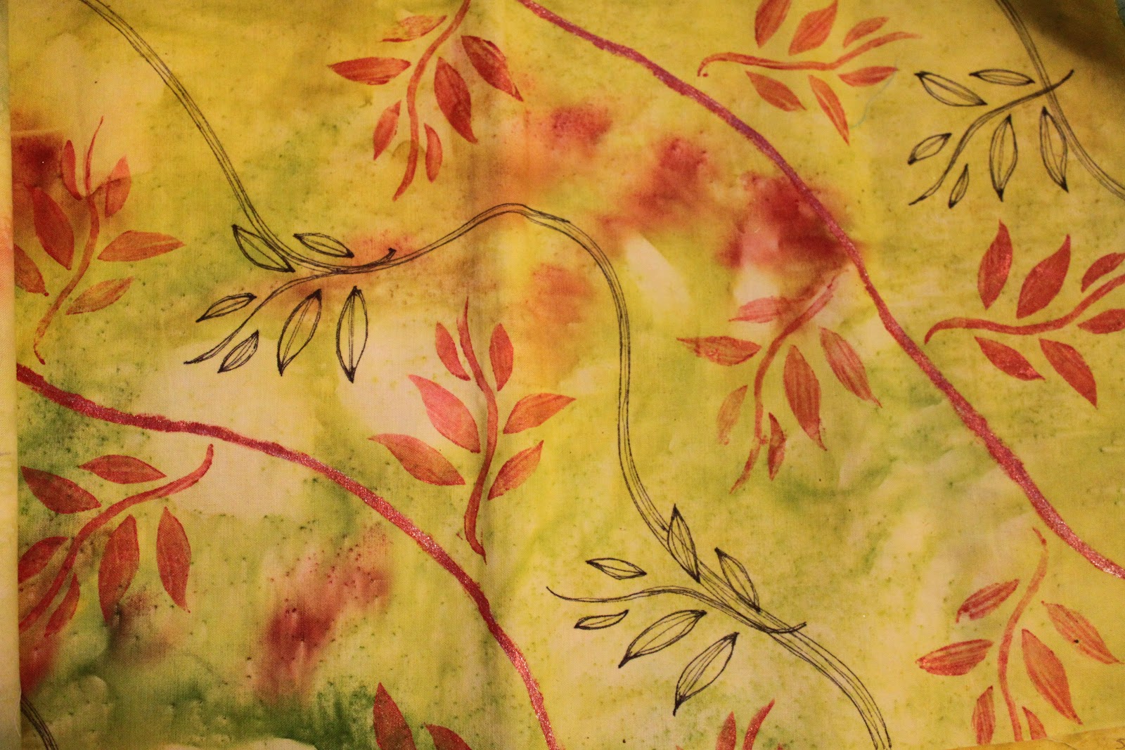
 As promised, here are the four pieces I got back in our second FANE renga project.  I had made the initial design by sunprinting with Setacolor paints (see the original post from September here).  I think the people that followed me were reluctant to "mess up" the fabric because they liked it so much.  Each one just added a little touch in these two pieces above and below.
 On the next two pieces, some rust colored stems and leaves were added as you can see.  This particular section of the fabric didn't have as much variation in color or as many leaf-shaped prints, so it needed something else.  I like the results!
 The third person added some glitter paints in swirls on this piece.  Nice!
Looks like I'll have some fun and original fabric to work with in the new year!

Sunday, December 9, 2012

More Surface Design

 My Fiber Arts group did another surface design round robin, or renga.  This time, each person brought a half-yard of fabric with one treatment done to it.  That was then cut in half and passed to two new people, who each added a second treatment.  Then those two pieces were cut and passed again to four people.  These photos show the second treatments I did on the four pieces I received last month.

Above, I got a piece of fabric that was painted with teal green acrylic paint.  Although the fabric did not feel stiff, as you might expect with paint, it was on the dark side and a challenge to add to.  The second person added the dotted circles using more paint and a pencil eraser.  I simply dipped a pastry cutter into gold acrylic paint and made the thin wavy lines you see running all around.

Below was a piece of fabric that was dyed with a shibori technique in that beautiful blue color.  The second person added the black dots by printing with bubble wrap.  I added the white lace effect by printing with a metallic paper doily and acrylic paint.
 We were supposed to try some techniques that might be new to us, and I thought I might try distressing the piece below by adding some rusty touches.  The first person had made the dark purple rainbow-shaped monoprint at the bottom, and the second person had added dark purple rectangular shapes all around the edges.  Since I wanted to add rust stains, the first thing I did was wet down the fabric.  Unfortunately, the ink the previous person used was not permanent, and began running.  I wrapped up a bunch of rusty screws in the wet fabric and let it sit for a few days covered in plastic so it wouldn't dry out.  I got a few rusty spots, as you can see, and also an interesting effect from the running ink.  I kind of like it, despite the unexpected results.
 I found this last piece to be a challenge.  The first person had painted on the vertical green stripes, which also have a wavy texture to them.  The second person tried to join the stripes by adding horizontal dark blue stripes.  I tried to unite everything into a sort of plaid effect using a glue-gel resist and acrylic paints.  I debated whether or not to use contrasting colors, and then decided to go for it.  I like the color combo, but I'm not sure it really ties the other elements together very well.  Something in the blue-green family probably would have done that better.  Live and learn!
This was another fun experiment and learning experience.  It was fun to try new techniques without really being too overly concerned with the final product and to learn new techniques from other group members.  I feel like I'm beginning to get a better sense of what works and what doesn't, as far as texture and color combinations.  It was also fun to compare how the four pieces of the original fabric looked after all the different treatments they received.  Some of them looked great together - similar, but different, like fabrics in a designer's collection.  I'll share the results of my fabric in the next post...

Wednesday, November 28, 2012

A Little Publicity!

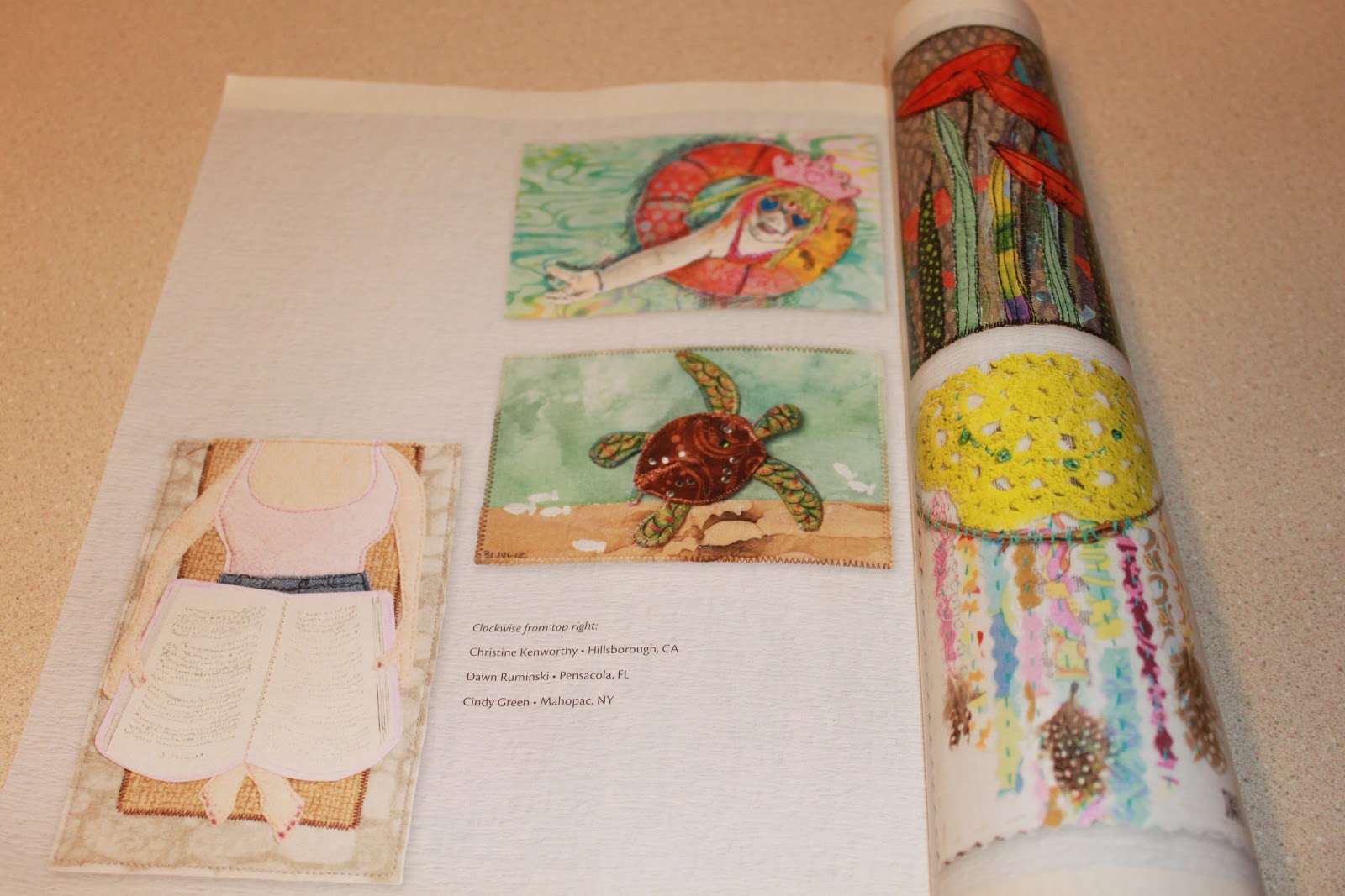
Once again, I was fortunate enough to have a postcard printed in Quilting Arts Magazine!  I originally posted it here before I mailed it in.  Now that it's in, I'm glad I took the time to create one.  It was a fun challenge to get my vision down in the small 4x6-inch frame, I got to use both fabric and paper (the book is paper) and now I get to see my work in print!  Fantastic!  (If you go to the link where I first posted it, you may notice I positioned it with the feet pointing up.  I intended for the viewer to imagine themselves in the artwork, being the person relaxing with a book in the sun!  But QA decided to place it the other way around.  I guess that works too...)

Sunday, September 23, 2012

Staycation Postcard


Quilting Arts Magazine is sponsoring another postcard challenge.  The theme for this one is "what I did on my Staycation."  Even though we did actually get away to the beach at the end of the summer, most of the summer I was home and working but took little "staycations" by escaping into a book.  I still think it's the most fun, relaxing, inexpensive, and easy way to get away from it all!

Monday, September 17, 2012

Tackling a Big Job

 The bushes and shrubs in front of our house have gotten very overgrown in the past couple of years.  We mistakenly put too many plants in too close together and I wasn't sure what to do about it.  I trimmed what I could, but I didn't want to overdo it and ruin the shape of some of the trees, like the dwarf Alberta spruce.  I considered digging up some of them and moving them to another location in the yard, but that seemed crazy.  Here are a couple of shots of a weeping cherry, a golden cedar, and two of the dwarf Alberta spruces.  There were two cedars and two spruces way too close together.  They almost reached to that bedroom window, as you can see.
Finally, over the weekend, I couldn't stand how messy and out of control they all seemed.  I started by clipping some goldenrod that had found their way into the mess, then trimmed back the weeping cherry and the azealeas beneath it.  Then I tackled the cedars.  I'd been thinking all these years that it was just one big trunk under all that foliage, but there were about 6 smaller trunks.  I cut off just one or two at first, but then ended up removing an entire plant.  Below is my pile of clippings!
 Once I got started, I almost couldn't stop!  I could feel the plants breathing a big sigh of relief because they were finally getting some air and light.  I left one of the cedars, but gave it quite the haircut!  I also cut out an entire spruce.  There was a tiny Andromeda struggling between the cedar and the spruce, so I dug that out and moved it over.  It looks so much better!  Now I even have room to put in some flowering seasonal plants, like some mums to brighten it up a bit.  Even though it seems almost shockingly sparse, I bet by this time next year, it will look just right!

Just goes to show you what you can accomplish with a few simple tools, a little determination, and an afternoon of hard work!


Saturday, August 25, 2012

More Surface Design

 Next week we will be away at the beach and my FANE group meets the following week.  I've been kind of stalling on the next layer of the "renga" surface design round-robin we are doing because I just wasn't sure what to add to this fabric.  The person before me sketched in a landscape as you see above. I still think some members are getting confused about the exercise and are trying to add to a work of art with a focal point rather than simply experimenting with various surface design techniques.   After pondering how to continue, I decided I wanted to back away from the landscape direction, if possible, and try to add just a layer of design.  Since I already worked with acrylic paints twice so far, I figured I'd better try something else.

I bought myself a bunch of Shiva oil paint sticks several years ago because many artists in the group and in QA magazine were raving about them.  I like them, but I'm not totally wild about them for a few reasons.  They are kind of pricey, and to have any assortment of colors, you could spend a lot.  They also need time to cure, sometimes as much as a few weeks or even a month, so you have to plan that time into your project.  And every time you use them, you have to peel away a "skin" that forms over the crayon, which seems like such a waste of product.  But since I haven't used them in a while, I decided to break them out again and play around.  I found this book containing texture plates for making crayon rubbings that used to belong to one of the girls, so I flipped through it and chose a few textures that might work with the fabric.  I picked out three paintsticks, one dark green, one light green, and one turquoise metallic.
 I used three different textures: one on the upper portion of the fabric, one in the center, and another towards the bottom.  It still looks very much like a landscape, but at least the originator won't be completely forced to go in that direction if she doesn't want to.
I thought maybe my own surface design fabrics could use a little texture as well.  I added some of the dark green with a sort of petal-shaped texture plate to this fabric after I painted in some copper acrylic paint accents with a brush.
And I added some wavy lines with the turquoise metallic paintstick and another texture plate.  This fabric could probably use some more layers, as there are only two here, but I'll have to ponder that a little more.  I wonder what I'll create with all these new and unique fabrics...

Sunday, July 17, 2011

Mixed-media house

Cloth Paper Scissors magazine recently featured a "home sweet home" reader challenge. In their May/June 2011 issue, they included a pattern for a little house (about 2" x 3" x 4" tall) and invited readers to use any media they wished to decorate it, then send in some photos. My FANE group decided to make these as well, and they may be included in our next show at the Mahopac Library coming in September.

The deadline for submission was July 1, so I didn't get this done in time to submit it, but I sure had fun pulling out all my boxes and bags of materials! I could think of a bunch of ways I wanted to approach this but decided on a "Four Seasons" theme.
The front of the house is obviously winter, and features a currogated cardboard "log cabin" exterior, two needle felted wool evergreen trees sprinkled with snowy glitter, a rick-rack wreath, and little snowflakes I cut out of a piece of lace ribbon.
Spring features a fabric tree, some blooming seed bead daffodils, and a felt bunny.
Summer might be my favorite. I painted a beach scene with Caran Dache watercolor crayons and added some sparkle tulle for water and sprinkled on real sand. I happened to have a small piece of picket fence I picked up at a craft store years ago but knew I would use some day and today was the day!
Autumn was the first wall I finished. I machine stitched on the yarn for a tree and used some oak leaves I cut with a small paper punch. I glued a little black cat in the window - can you tell?

The roof is a flattened piece of birch bark I've had laying around, which I cut into shingles and glued on. I'm happy with the overall look and really enjoyed playing with all my supplies. It was fun to think of something I might use and then look around to see that I had it and didn't need to run to the store! It was also fun getting to use a variety of materials, instead of mainly fabric. Now I only wish I had made that July 1st deadline!

Monday, May 2, 2011

Creeping Along

This weekend I was able to steal away for an hour or so to see all the beautiful quilts on display at the Northern Star Quilters Guild's annual World of Quilts show. My Fiber Arts Northeast group was invited to display the pieces we showed at the Mahopac Library last June, so I did have something in the show, but I'm not a member of the guild and didn't submit anything else this year. (I also forgot to bring my camera but hope to get some photos from a friend who was also there, in which case I'll share them with you later this week). As you can probably guess, there were many inspiring quilts there and just walking around gazing at them all left me feeling very in awe of the skill of so many people! There were many fine examples of Art Quilts, including the one selected as "Best of Show." There were also many quilts with traditional patchwork patterns, but what stood out for me was the individualism of each quilt. I've gone to the show for several years and never feel like I'm seeing the same things again and again. Each quilter puts their own spin on a quilt and makes it unique by the fabric choices and stitching patterns. There were some antique quilts also on display, which brought home the sense of how long women have been using fabric to express themselves, even in useful ways like covering a bed. It was really a beautiful show.

I did kind of leave there wishing I could be more productive myself, especially as one third of the year is already behind me and I haven't made any new peices beyond my weekly "quickie" art. But as I headed to the grocery store to buy a week's worth of breakfasts, lunches and dinners, I had to admit that I still don't see how I can possibly fit more into each day. The times I'm not doing something are the times I really need some down time. Otherwise I really keep pretty busy. I do sometimes find myself procrastinating in a productive way, by reading, cleaning, or doing laundry, so this afternoon after work, I made an effort to dig into my second attempt at painting the background fabric for this Work in Progress. I pressed the fabric first, then decided to sponge on some resist to prevent the watery blue paint mixture from coming too far down and covering what will be the sand. After that dried, I went ahead and splashed on the paint. Here it is drying outside on the patio table. I hope I'm happy with the results...!
While the resist was drying, I went back to one of my "weekly" pieces that was supposed to be a goal of mine for the year. I had started this a few weeks ago, but got to a certain point and knew it needed something, but i wasn't sure what. I'm considering using it for our next FANE challenge, which is to make a piece using an object found in an unusual place. The main piece of "fabric," that mottled greenish-pink piece, is not really fabric at all. When I was at the Country Quilter's fall retreat in 2009 at the Interlaken Inn, I happened to notice the exceptional quality of the paper towels in the ladies room! I actually swiped a few of them and have held onto them as possible quilt material. I read a tip recently in Cloth Paper Scissors magazine that suggested you sop up extra paint and ink with cloth or paper towels (rather than dumping it down the drain) and then use the colorful results in your art. So that's where that came from!

As you can see, I'm back in the copper-patina-aqua color scheme. In addition to the paint-splashed paper towel, I have a small square of silk, a strip of metallic lacy fabric I found at Joann's Fabrics, and a piece of copper mesh painted with alcohol inks and stitched on. I had gotten this far, when I stopped to figure out what else it needed. I considered adding more hand stitching, but I just wasn't sure. Then last night, my husband took the last onion out of the bag in the fridge and I swiped it and left it on my art table. I decided maybe I could put the plastic mesh to use...I was also at A.C. Moore last week getting more ink and paint, and these unusual paperclips in the scrapbooking section caught my eye. Aren't they cool? Right away, my oldest daughter hooked a bunch of them together and made a bracelet, but I put the rest away with my other copper and metal things, until this afternoon......when I combined it all with a few beads and things, now it looks like this:

Much better, right? I still want to do a bunch of hand stitching on it, but I'm liking it a lot better than before! (It kind of reminds me of this one I did back in 2008 - maybe they'll be a pair). With all the "found objects" in this piece, I may as well use it for the next challenge! Now I'll go see if the painted fabric is dry and if it looks the way I hoped...

Thursday, October 14, 2010

Conceptual Art Challenge

I just got back from the October FANE meeting, the rain is drumming on the roof, and I am ready to put on my PJs and put on "Project Runway" while I blog about the meeting and show you my latest creation. Above is the entire piece which is roughly 18"x18". I'm not sure that it actually qualifies as Conceptual Art, since it really is a piece of art, but I like the way it looks. Since the concept we were trying to get across was art quilting, I ended up making an art quilt! (What else?) We had to make a statement about our pieces (I don't really like explaining what I've made - if you don't get it by looking at it, then it's not a successful piece!), so I'll give you a synopsis of what I said. To me, an art quilt essentially has texture, color, and layering. It is a form of self expression by the artist, and somehow expresses a sense of joy or fun in the creative process. I basically went through my fabric stash and picked out swatches of some of my favorite colors and textures. I ended up using close to 50 different fabrics ranging in texture from burlap to silk. I de-emphasized shape by sticking to squares and rectangles, so the textures and colors were the focus.
Embellishments are some of the most fun elements of art quilts, so I had to include some. I used buttons, rick-rack, safety pins, beads, copper foil, copper mesh, and various natural found objects. Even though the piece is very abstract, some of the colors and textures reminded me of elements of nature, like water, sky, trees, and seasons.
The meeting tonight was really great - it was a struggle for all of us to grasp Conceptual art and try to come up with something of our own, but all the pieces were meaningful, fun, interesting, and exciting. Visit the FANE blog in the next few weeks to see what everyone else did and read their statements.
Now, who's going to Bryant Park on Project Runway?!?!
(I predict Mondo, Michael, and Andy).

Saturday, September 4, 2010

More Sketchbook Activity

Here are two more pages I created for my sketchbook. The "Spring Songbird Symphony" I started thinking about last spring - I heard all these birds at once and I wanted to recreate the experience, but I wasn't sure how: poetry? music? collage? I finally got the idea to create something that is a combination of the three. I hope it captures the feeling of a spring morning walk.
And now we skip ahead to autumn! I cut a bunch of canvas rectangles to fit into the sketchbook and have been treating the backgrounds in various ways, then stitching, stamping or writing to complete the "sketch." Again, I consider this a sketch because it's not quilted through three layers and it's quick - not too much pondering and critical thinking, just doing it. Here, I put a layer of gesso down on the canvas first, and used a comb-type tool to make a groovy texture before it dried. When it was dry, I added color with the water-soluble crayons and blended them with a brush and my finger. Finally, I stamped on some leaves and stitched on the large one cut from an interesting paper I had in my stash.
Finally, here is my "Facetious" piece. The definition I was working with for facetious was "to treat a serious subject lightly." I chose a serious subject (war) and found some public domain photos on the web. I transferred them to white fabric using the CitraSolv method. Then I chose fabrics and embellishments in light, happy colors and layed everything out like a page in a scrapbook.
Unfortunately, I think the contrast between the serious subject matter and the light, happy colors goes beyond merely being facetious. To me, it borders on inappropriate, insensitive and disrespectful. That certainly was not my intention; I was only trying to be facetious!


Thursday, June 17, 2010

In Print!

Do you recognize that cute little pendant with the fish on it on the bottom of page 85 in the latest (July/August) issue of Cloth Paper Scissors magazine? Yep, that's mine! I kind of had a feeling about that pendant, just thought it might be cute enough to make the cut, and I was right! Feels good to know that someone else thinks enough of something you created to put it in print. (Click here to see it as I originally posted it). AND, since I made four other similar ones, maybe it's time for me to put them up for sale at an ETSY shop! It would be a great summer item... Now I just have to find the TIME!!!!!
The magazine announced a new challenge in this issue: A mixed-media mini book! I will probably enter my little "April Showers" book from last spring. If you'd like to see it and you haven't, click here. (I kind of have a good feeling about that one too...)
There is another article in this issue, the second in a series of three by Dawn Devries Sokol called "Art Journaling: Pages in Stages." In the first article, she talks about her difficulty getting started art journaling and then outlines steps she used to help her get over that difficulty. The first step was to paint the pages, the second step, discussed in this article, is adding collage elements such as text or pictures from magazines, rubber stamps, ink blotches, crayon lines etc. Maybe I can use some of her tips to help me get started on my Sketchbook. Busy, busy, busy!

Sunday, June 13, 2010

Two New Adventures

This is a photo of the night table next to my bed. It holds my reading lamp, some favorite photos of the girls, and my new sketchbook. I decided to take a flying leap into the unknown and join The Sketchbook Project sponsored by the Art House Co-op in Brooklyn. I have until early January to fill up these 40 pages and send it back. Then it goes on tour around the country, where people attending the exhibit get to pick it up and read it. You get to choose a theme or have one assigned to you. I almost chose "Storybook" but went instead with "This is not a sketchbook." That leaves my options wide open.
I think I was enticed by the idea of having some original pieces being seen by a variety of people (I do wonder who attends these exhibits...). And of course, being a book lover and sometime writer, I had to take a chance at creating something like this. But even though I have six months to fill it up, I am already getting a little frozen at the thought of it. I often hear of how some writers and artists take one look at that blank, white, empty page and freeze at the thought of putting something down, probably because of the pressure of trying to make it perfect. Well, here is a whole bookful of blank white pages staring back at me! And I'm big on re-doing; my eraser and seam ripper are always close at hand. What if I put something down and then hate it? Do I rip out the page?
One thing that is taking the pressure off is that the general rules are really very loose. I could rip out pages if I want. I could even undo the binding, create a complete book out of fabric and and then stitch it back into the cover, if I wanted to. And I'm actually considering doing that.
So what I've been thinking about is, if this is not a sketchbook, as my theme states, then what kind of book is it? It could be a storybook or a picture book, or a book of illustrated poems (like one of my unofficial goals for this year). It could be an ABC book or a dictionary or a journal.
I am mulling this over as I go about my busy life.
I think I'll keep the book on my night table to keep it fresh in my thoughts! And I'll try not to put too much pressure on myself, but keep it fun!
My second new adventure is taking my first e-course with mixed-media artist Kelly Rae Roberts. It's a 5 week course called "Flying Lessons: tips & tricks to help your creative business soar." The flying metaphor goes along with her book, Taking Flight. Although I did get her book from the library about a year ago, I didn't buy it and I didn't do any of the suggested art activities. But I did pick up some good blogs and websites to visit, and there is a lot more of that type of information in the course so far. Her metamorphosis from social worker to full-time professional artist with licensing contracts took only 5 or 6 years. And while she claims anyone can do it and encourages everyone to try, I think there has to be a lot more to it, everything from natural talent, to hard work and dedication, to plain old dumb luck. She seems to have had all of these, as well as all the personal time she needed to dedicate to art, self-exploration and self-expression. My current reality is very different from hers and I don't expect miracles from the course, just maybe a gentle nudge in the right direction. One of the ideas she strongly encourages is having an active presence on Facebook and Twitter. I do have a personal facebook page, but I don't use it much and I have not joined Twitter. I just don't see myself having the kind of time it takes to log on so often to post things (I'm lucky I can leave a few photos and ideas here once or twice a week!). (I think a lot of people do it from their cell phones, but I have one of those good old fashioned phones that I use mainly for emergency calls and the occasional text message!).
So those are my two new adventures, and as I progress through them, I'll keep you posted. For now, I have my constant companion and big yellow shadow keeping me company along the way!