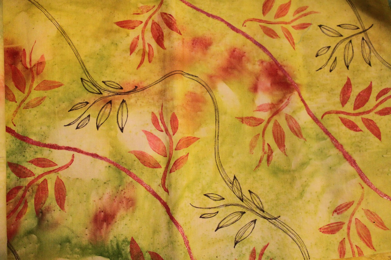
As promised, here are the four pieces I got back in our second FANE renga project. I had made the initial design by sunprinting with Setacolor paints (see the original post from September here). I think the people that followed me were reluctant to "mess up" the fabric because they liked it so much. Each one just added a little touch in these two pieces above and below.
On the next two pieces, some rust colored stems and leaves were added as you can see. This particular section of the fabric didn't have as much variation in color or as many leaf-shaped prints, so it needed something else. I like the results!
The third person added some glitter paints in swirls on this piece. Nice!
Looks like I'll have some fun and original fabric to work with in the new year!
Pages
Showing posts with label renga. Show all posts
Thursday, December 13, 2012
Sunday, December 9, 2012
More Surface Design
My Fiber Arts group did another surface design round robin, or renga. This time, each person brought a half-yard of fabric with one treatment done to it. That was then cut in half and passed to two new people, who each added a second treatment. Then those two pieces were cut and passed again to four people. These photos show the second treatments I did on the four pieces I received last month.
Above, I got a piece of fabric that was painted with teal green acrylic paint. Although the fabric did not feel stiff, as you might expect with paint, it was on the dark side and a challenge to add to. The second person added the dotted circles using more paint and a pencil eraser. I simply dipped a pastry cutter into gold acrylic paint and made the thin wavy lines you see running all around.
Below was a piece of fabric that was dyed with a shibori technique in that beautiful blue color. The second person added the black dots by printing with bubble wrap. I added the white lace effect by printing with a metallic paper doily and acrylic paint.
We were supposed to try some techniques that might be new to us, and I thought I might try distressing the piece below by adding some rusty touches. The first person had made the dark purple rainbow-shaped monoprint at the bottom, and the second person had added dark purple rectangular shapes all around the edges. Since I wanted to add rust stains, the first thing I did was wet down the fabric. Unfortunately, the ink the previous person used was not permanent, and began running. I wrapped up a bunch of rusty screws in the wet fabric and let it sit for a few days covered in plastic so it wouldn't dry out. I got a few rusty spots, as you can see, and also an interesting effect from the running ink. I kind of like it, despite the unexpected results.
I found this last piece to be a challenge. The first person had painted on the vertical green stripes, which also have a wavy texture to them. The second person tried to join the stripes by adding horizontal dark blue stripes. I tried to unite everything into a sort of plaid effect using a glue-gel resist and acrylic paints. I debated whether or not to use contrasting colors, and then decided to go for it. I like the color combo, but I'm not sure it really ties the other elements together very well. Something in the blue-green family probably would have done that better. Live and learn!
This was another fun experiment and learning experience. It was fun to try new techniques without really being too overly concerned with the final product and to learn new techniques from other group members. I feel like I'm beginning to get a better sense of what works and what doesn't, as far as texture and color combinations. It was also fun to compare how the four pieces of the original fabric looked after all the different treatments they received. Some of them looked great together - similar, but different, like fabrics in a designer's collection. I'll share the results of my fabric in the next post...
Above, I got a piece of fabric that was painted with teal green acrylic paint. Although the fabric did not feel stiff, as you might expect with paint, it was on the dark side and a challenge to add to. The second person added the dotted circles using more paint and a pencil eraser. I simply dipped a pastry cutter into gold acrylic paint and made the thin wavy lines you see running all around.
Below was a piece of fabric that was dyed with a shibori technique in that beautiful blue color. The second person added the black dots by printing with bubble wrap. I added the white lace effect by printing with a metallic paper doily and acrylic paint.
We were supposed to try some techniques that might be new to us, and I thought I might try distressing the piece below by adding some rusty touches. The first person had made the dark purple rainbow-shaped monoprint at the bottom, and the second person had added dark purple rectangular shapes all around the edges. Since I wanted to add rust stains, the first thing I did was wet down the fabric. Unfortunately, the ink the previous person used was not permanent, and began running. I wrapped up a bunch of rusty screws in the wet fabric and let it sit for a few days covered in plastic so it wouldn't dry out. I got a few rusty spots, as you can see, and also an interesting effect from the running ink. I kind of like it, despite the unexpected results.
I found this last piece to be a challenge. The first person had painted on the vertical green stripes, which also have a wavy texture to them. The second person tried to join the stripes by adding horizontal dark blue stripes. I tried to unite everything into a sort of plaid effect using a glue-gel resist and acrylic paints. I debated whether or not to use contrasting colors, and then decided to go for it. I like the color combo, but I'm not sure it really ties the other elements together very well. Something in the blue-green family probably would have done that better. Live and learn!
This was another fun experiment and learning experience. It was fun to try new techniques without really being too overly concerned with the final product and to learn new techniques from other group members. I feel like I'm beginning to get a better sense of what works and what doesn't, as far as texture and color combinations. It was also fun to compare how the four pieces of the original fabric looked after all the different treatments they received. Some of them looked great together - similar, but different, like fabrics in a designer's collection. I'll share the results of my fabric in the next post...
Sunday, October 28, 2012
In the Midst of Many Projects...
... and trying to get some of them finished! I haven't blogged that much about the various projects going on in the house right now, partly because I've been so busy going from one to the other, and partly because I haven't stopped to clear a space to photograph anything! Time to catch you up a little on what's been going on around here.
Let's start with the charm bracelets. I've been trying to craft a decent variety and quantity so I can submit them to sell at the Putnam Arts Council's annual holiday craft sale. I've made at least two with a red and green Christmas theme, two with a pale blue and white winter/snow theme, and two of the retro 70s Bohemian denim and copper style. I also have one with a spring "flowers and birds" theme and one of the ocean themed turquoise and silver. I'd like to make one more of each of those and then take some great photos of everything, which I'll post. Meanwhile, here's a group shot of some of the jewelry on a display rack with two cluster necklaces (which you can't see in the photo - I'll rephotograph them all individually soon!)
In addition to my ongoing projects, my daughters have also been taking their turns at the craft table. One recently finished a large batik project using Elmer's glue gel and acrylic inks, but she gave it away before I had the chance to photograph it! My younger daughter painted the black t-shirt below with the symbol of her zodiac sign, Libra. We used freezer paper as a stencil and sponge-painted on acrylic paints. It looks great and she's so proud to have made it herself! She also created a cool sculpture of a dragon head using paper clay, and designed felt horns for a sweatshirt hood, which I stitched in place. I'm so glad the girls see the value and pride in making things with your own two hands!
Friday after school they had a friend over for a pumpkin carving session. Our town hosted a Pumpkin Fest this weekend and gave free pumpkins to any school-age child who promised to carve or decorate it and bring it back to the town park for display. I'll post pictures of those another time, but meanwhile, here are the pumpkin spice cupcakes I baked in honor of the occasion. The recipe is very simple: pretty much just stir a whole can of pumpkin into a carrot or spice cake mix. Add 3 eggs and 1/4 cup each of water and oil. Mix and bake for 16-20 minutes, then frost with cream cheese frosting. Delish!
Last Thursday, my FANE group met and we started a second round of Renga fabric exchanges. This time, we each altered a half-yard of white fabric, then cut it into two fat quarters which each went to two different people. Below are the two pieces of cloth I received:I stuck with the raspberry and lemon color palette for the first piece of fabric. I didn't want the shapes to be too angular and geometric, to match the tie-dye effect that's already there. I went with irregular trapezoid shapes and scattered them around on the fabric like this:
Then I spritzed the whole thing very well with water. Sometimes air bubbles got trapped underneath the tissue, so I had to smooth everything down and make sure it was in contact with the fabric.
Here's the finished product: (I shot this in a different light than the photo above and it looks kind of washed out. It really has more of a pale yellow color than this almost white).
With the second piece of fabric, I chose to go with wavy lines in a teal green shade. I like the look of this one (I really have some obsession with fabric that looks like water, don't I...?)
I managed to get the worktable cleaned off just in time for my DH to begin building a new wall in order to enlarge my daughter's bedroom. Here are the studs going up...
... and here is the shelf I had to clear of stuff, which is now all over the worktable! These cubbies will be turned on end and move against the second new wall, ...... which will be several feet out from where this wall (with the door) currently is. This room was originally his home office and he graciously gave it to her for a bedroom, but it had no closet. When it's all done, she'll have a larger space as well as a closet. This way, her room will be that much neater and more organized, right? Right! (LOL! I'll believe it when I see it!). It better be worth all this effort!
Now all that is going on indoors, of course there are all the outdoor chores coming up. I just cleared off this deck on Saturday, but the winds from approaching hurricane Sandy have already shaken enough oak leaves down to cover it up again! If that's the worst we get from the storm, I'll take it!
Of course, we are all preparing for the worst but hoping for the best. I stocked up on everything I could think of and made great efforts to keep up with the laundry and housecleaning this weekend. I learned a lot from the two big storms we had last year and I know how to prepare now! Since the brunt of the storm seems to be headed well south of here, I'm hoping we'll only get some heavy winds and rains - enough to close the schools but not enough to take down power lines! (From my lips to God's ears...)Have a safe week and see you on the other side!
Thursday, September 13, 2012
A Shot at Sun Printing
We've been having perfect late summer weather here in the Northeast: warm, dry days and cool crisp nights. The daytime skies are clear and blue with barely a cloud. The other day, I was home from work early (so the guy could give our oil burner its annual cleaning) and decided to take advantage of the weather to try sun printing. I started by collecting some ferns and leaves that I thought might make nice prints. Then I took a half yard of prewashed white cotton fabric and spread it out on our outdoor table in a sunny spot (I put a plastic tablecloth underneath to protect the table). I spritzed the cloth with water from a spray bottle and splashed on some Pebeo Setacolor paints mixed with water. I chose fallish colors - dark green, golden yellow, and a rusty red. Then I placed my leaves and ferns all around and weighted some of them down with rocks, as you see above. I didn't collect enough leaves and things, there were some empty spaces between them. I thought about adding a few more, but since it was such a dry, sunny day, the paint was quickly drying. Instead, I sprinkled some of the empty spots with salt, which leaves speckles.
I also realized (a little late) that I should have chosen a different sunny spot - the shadow of the house very quickly threatened to overtake the whole piece of cloth - but luckily, my daughter's came home from school and were able to help me move the table further out.
Below is how the cloth looked after it dried in the sun and all the salt and leaves were removed. You can see how the places where the leaves blocked the sun turn white.
The cloth came out pretty well, and I'm considering using it for another "renga"-type project in my FANE group. This time, the half-yard will be cut in two and go to two different people. Since I can't make the next meeting, I'm not sure if I'll participate. If not, I may add some leaf prints or stamps to it myself.
More importantly, I learned a few things about sun printing: have more objects than you think you'll need, give yourself plenty of room away from any encroaching shadows, and results might be better if you use paper cut-outs of shapes rather than leaves and ferns that curl up and away from the fabric, making less clear prints. Anyway, it was a nice excuse to be outside in the sunshine clipping leaves and playing with paint!
I also realized (a little late) that I should have chosen a different sunny spot - the shadow of the house very quickly threatened to overtake the whole piece of cloth - but luckily, my daughter's came home from school and were able to help me move the table further out.
Below is how the cloth looked after it dried in the sun and all the salt and leaves were removed. You can see how the places where the leaves blocked the sun turn white.
Here is a close up of one area where you can see a part of a fern, an ivy leaf, and many speckles from the salt.
Here is another spot on the cloth where the ivy vine and some of the maple leaf prints are visible.More importantly, I learned a few things about sun printing: have more objects than you think you'll need, give yourself plenty of room away from any encroaching shadows, and results might be better if you use paper cut-outs of shapes rather than leaves and ferns that curl up and away from the fabric, making less clear prints. Anyway, it was a nice excuse to be outside in the sunshine clipping leaves and playing with paint!
Saturday, August 25, 2012
More Surface Design
Next week we will be away at the beach and my FANE group meets the following week. I've been kind of stalling on the next layer of the "renga" surface design round-robin we are doing because I just wasn't sure what to add to this fabric. The person before me sketched in a landscape as you see above. I still think some members are getting confused about the exercise and are trying to add to a work of art with a focal point rather than simply experimenting with various surface design techniques. After pondering how to continue, I decided I wanted to back away from the landscape direction, if possible, and try to add just a layer of design. Since I already worked with acrylic paints twice so far, I figured I'd better try something else.
I bought myself a bunch of Shiva oil paint sticks several years ago because many artists in the group and in QA magazine were raving about them. I like them, but I'm not totally wild about them for a few reasons. They are kind of pricey, and to have any assortment of colors, you could spend a lot. They also need time to cure, sometimes as much as a few weeks or even a month, so you have to plan that time into your project. And every time you use them, you have to peel away a "skin" that forms over the crayon, which seems like such a waste of product. But since I haven't used them in a while, I decided to break them out again and play around. I found this book containing texture plates for making crayon rubbings that used to belong to one of the girls, so I flipped through it and chose a few textures that might work with the fabric. I picked out three paintsticks, one dark green, one light green, and one turquoise metallic.
I used three different textures: one on the upper portion of the fabric, one in the center, and another towards the bottom. It still looks very much like a landscape, but at least the originator won't be completely forced to go in that direction if she doesn't want to.
I thought maybe my own surface design fabrics could use a little texture as well. I added some of the dark green with a sort of petal-shaped texture plate to this fabric after I painted in some copper acrylic paint accents with a brush.
I bought myself a bunch of Shiva oil paint sticks several years ago because many artists in the group and in QA magazine were raving about them. I like them, but I'm not totally wild about them for a few reasons. They are kind of pricey, and to have any assortment of colors, you could spend a lot. They also need time to cure, sometimes as much as a few weeks or even a month, so you have to plan that time into your project. And every time you use them, you have to peel away a "skin" that forms over the crayon, which seems like such a waste of product. But since I haven't used them in a while, I decided to break them out again and play around. I found this book containing texture plates for making crayon rubbings that used to belong to one of the girls, so I flipped through it and chose a few textures that might work with the fabric. I picked out three paintsticks, one dark green, one light green, and one turquoise metallic.
I used three different textures: one on the upper portion of the fabric, one in the center, and another towards the bottom. It still looks very much like a landscape, but at least the originator won't be completely forced to go in that direction if she doesn't want to.
I thought maybe my own surface design fabrics could use a little texture as well. I added some of the dark green with a sort of petal-shaped texture plate to this fabric after I painted in some copper acrylic paint accents with a brush.
And I added some wavy lines with the turquoise metallic paintstick and another texture plate. This fabric could probably use some more layers, as there are only two here, but I'll have to ponder that a little more. I wonder what I'll create with all these new and unique fabrics...
Monday, July 23, 2012
Another Renga Layer
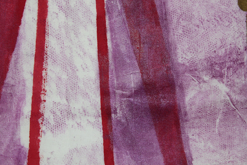
When my FANE group met a few Thursdays ago, we swapped our renga fat quarters again. I received the piece above, which has two design layers on it already. The originator of the piece monoprinted with lace in the lavender gel inks and the next person added the bold red and gold lines and circles with a stencil. You can see a little more of the original lace texture in the close-up below (click on the picture to enlarge it).
At first I thought of printing on some yellow circles here and there, but I was hesitant to add another color. Instead, I decided to soften everything by doing more printing with lace. I mixed white acrylic paint with a fabric medium and spread it out on an acrylic plate. Then I lay a scrap of curtain lace in the paint and used it to print on top of the other two layers.
I covered the lace with a piece of scrap paper and rubbed it smooth to ensure a good print. Below is a close-up of the results...
At first I thought of printing on some yellow circles here and there, but I was hesitant to add another color. Instead, I decided to soften everything by doing more printing with lace. I mixed white acrylic paint with a fabric medium and spread it out on an acrylic plate. Then I lay a scrap of curtain lace in the paint and used it to print on top of the other two layers.
and this is what the whole cloth looks like now. It will get one more layer before it goes back to the original artist. Hope she likes it!
Monday, July 16, 2012
More Surface Design
Thursday evening, my FANE group met to share the Renga fabrics we've been collaborating on (read more about it here). Everyone is so creative and using so many different techniques and materials! Some used stencils or rubbings with Shiva paint sticks, some used dyes or acrylic paints or inks, others stamped an outline with Staz-On inks and used crayons to fill in the design! It was fun seeing all the varied results. A few of the observations I had were that a) some people were afraid of "messing up" a piece of work that another person started; b) some people seemed to be thinking more in terms of a finished piece of art with a focal point rather than a piece of fabric with a design on it; and c) I was either impressed with the clever additions people made or feeling like I would have approached it differently. All these things made me want to go home and try some more experiments with surface design, so that's what I did!
Below is another fat quarter that I spritzed with water, randomly painted with two different shades of Setacolor paints, then left crumpled up to dry. It's interesting how the random paint blotches left less of a visible impression than the crumpling.
I liked the results right away, but knew it needed more. Since I'm doing this process solo, I don't have to wait a month to have someone else add the next layer - I went ahead and did it myself! I decided I'd continue with the green theme and print some leaves on next using acrylic paints. I've learned through trial and error that the best way to do this is to cover the back of each leaf with a thin layer of paint using a paintbrush, then invert it onto the fabric where you want the print, covering it with a paper towel and rubbing it with your fingers to ensure a good print. You can really get a nice detailed print this way.
Here is a close-up shot:
I think it still needs something else, so I'll probably add another layer or two during the week - maybe some copper or gold veining or patches of yellow here and there. I had so much fun with that, I decided to reproduce the original first layer I did for the group Renga. I used Batik EZ by Crafter's Pick to make wavy lines over my prewashed fabric, let it dry, and painted over it with watered-down inks. I think this one came out even better than the original one I did for the group. The lines are smoother and wavier, rather than somewhat angular, and I used inks instead of paints (I couldn't find the certain bottle of ink I wanted to use last time, but found it exactly where it was supposed to be with the other inks!). I wonder what I'll add to this next...
I had a little bit of ink left over, so I used it to tie-dye this small piece of cloth. I accordian-folded the fabric, then rubber-banded it at various intervals and poured the ink over it. After it dried, it looked like this:
I was never real big on dyeing my own fabrics, but with inks and paints, it's really easy and not as time consuming as I originally thought. And it makes your art that much more original. Maybe I'll make a habit of doing this once a month or so, if the mood strikes me!
After all that, I still had a little ink left over! I found some plain wooden beads that were unvarnished or finished in any way and soaked them in the remaining dye. After they dried, I doodled little curly designs on them with gel pens and coated them with an acrylic varnish. Cute, huh? Now I have some original beads to use in my jewelry designs!
Gotta go get the girls from camp now. One thing I really miss about the school year is the buses! I don't particularly enjoy all this chauffering! Oh, well, a mom's gotta do what a mom's gotta do!
I was never real big on dyeing my own fabrics, but with inks and paints, it's really easy and not as time consuming as I originally thought. And it makes your art that much more original. Maybe I'll make a habit of doing this once a month or so, if the mood strikes me!
After all that, I still had a little ink left over! I found some plain wooden beads that were unvarnished or finished in any way and soaked them in the remaining dye. After they dried, I doodled little curly designs on them with gel pens and coated them with an acrylic varnish. Cute, huh? Now I have some original beads to use in my jewelry designs!
Gotta go get the girls from camp now. One thing I really miss about the school year is the buses! I don't particularly enjoy all this chauffering! Oh, well, a mom's gotta do what a mom's gotta do!
Monday, June 25, 2012
Renga Layer Added
Now that my studio is all clean and tidy, I had time to dig out some acrylic paint and add a layer onto the fabric I received in our FANE group Renga. I went with my original idea, which was to echo the circles Carolyn already started using silver paint. I dipped cans of various sizes into the paint to print the circles in a random way. I had to really stop myself from going overboard, as two more people will have to add more layers on top of this. I hope I succeeded! Here's a close-up of one section. The inks Carolyn used have a little bit of glimmer to them, so I think the silver works well with that and the original color scheme. On July 12th, I get to pass this onto the next person in the group, I receive another piece that already has two layers on it, and I get to see how my piece of fabric is progressing!
Also, in the process of cleaning and finishing up miscellaneous projects, I finally hung my totem! We have a high ceiling in the entryway which is really the only place it will fit, so I coaxed my Dear Husband up on a ladder and he kindly hung it for me. Here are a couple of shots so you can see how it looks:
There is other art in the entryway, some of it mine, some created by the girls, so it's a good spot for it. In this shot I'm standing in the living room near the piano, so it's visible from there. I wonder what people coming to the house will say about it...
Subscribe to:
Posts (Atom)